Projects / Opower
Opower Energy Widgets, Opower case study
Background
Opower's mission is to motivate everyone on earth to save energy.
Opower achieves this with a variety of print, email, and web experiences that use behavioral science to change the energy habits of utility customers. Utility companies all over the world buy Opower's products to drive energy savings and create happy, educated customers that cost less to serve. Opower was acquired by Oracle in the Summer of 2016.
Following my big-picture UX role at Urban Outfitters, I joined Opower hungry to sharpen my skills as a specialist in design execution. As a UX Designer/Developer, I carried out the visual design, illustration, and front-end development of Opower's products, and then tied it all back into our design system, Opattern. Learn more about how I worked with the surrounding teams at Opower, below.
My biggest takeaway from my time with the Opower design team is how to use design systems, reusable components, and effective documentation to build products. This case study will describe that process and the resulting artifacts.
The Prompt
Shortly before I joined, the design team had just completed building the first version of our new design system, Opattern. It was my job to apply this design system to our products and extend it as needed. In the case we'll cover today, I'll describe how I applied this design system to a family of existing "Energy Widgets". These widgets are essentially web apps that utility customers can use to explore different facets of their energy use. The family consisted of three widgets:
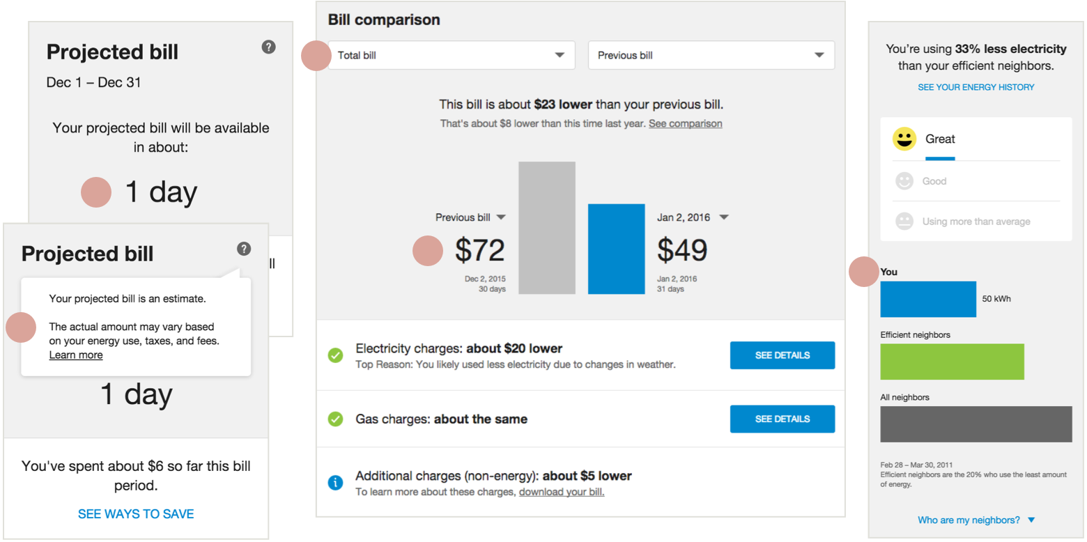
- Bill comparison: Diagnoses why your bill may be unusual.
- Projected bill: Tells you how much you're on track to spend in the next bill period and if it's unusual.
- Neighbor comparison: Helps you save energy by comparing your use with that of average and efficient neighbors.
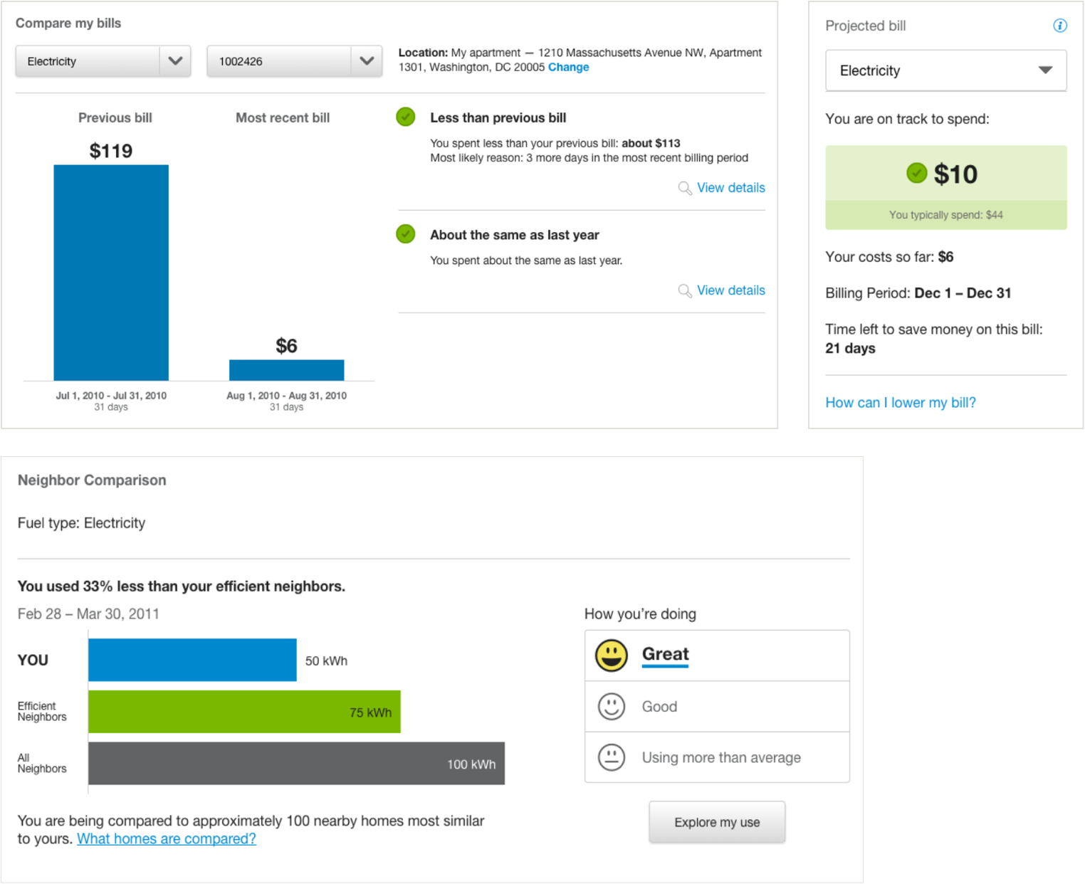
From left to right: Bill Comparison, Projected Bill, Neighbor Comparison
The Process
Define the problem
The scope of this project began as a simple reskin, but as I defined the problem through conversations with stakeholders in Product Management, Analytics, Engineering, and Design I uncovered more goals to consider. These were the highest priority goals from the list:
- Redesign with the Opattern design system.
- Design for international clients.
- Build reusable components for common patterns.
- Create a system for customization.
Some of the challenges I identified weren't unique to this project—they applied to all web products at Opower. While solving each one, I tried to think about how I could set up a system for others to recognize and solve these problems in their own work. The resulting artifacts are mentioned in each "Solution" below.
Explore solutions
With consultation from other designers on my team, I created a variety of quick wireframes and prototypes for the new design of each widget. The most important redesign goal was improved comprehension. This was achieved through consistent visual heirarchy and clear, friendly messages. My teammates in visual design and copywriting were crucial to achieving these goals, which we measured in a series of usability tests.
Test
The most promising designs for each widget were assembled into a mock "dashboard" on a generic utility site, which we presented to research participants in a series of qualitative studies. Participants were walked through a hypothetical journey that began with a "Bill Due" email and led to the dashboard with the energy widgets. They were encouraged to think aloud, describe what they were seeing, and let us know what interested or confused them.
My teammates in UX Research conducted these sessions, which took place over the course of 5 days and consisted of 9 remote desktop studies and 5 in-house mobile studies.
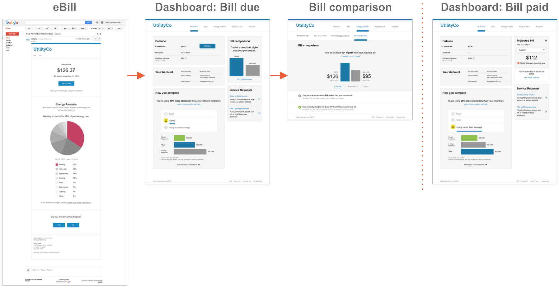
Desktop prototype journey.
Refine designs
Feedback from the usability studies were incorporated into the designs and presented to stakeholders in Product Management, Design, and Internationalization (goal #2). In turn, their comments were worked into the final design. I closed out this phase by creating Adobe llustrator files with designs for the most common states of each widget. Because I was also responsible for building the widgets, I left the design of less common states for the Build phase to make sure everything was accounted for.
Build!
In this final phase, I rebuilt the front-end of the widgets and made reusable components for common patterns (goal #3). It was also during this phase that I worked with Engineering to produce a system to customize web widgets and documentation for how to do so (goal #4).
Solutions
Goal #1: Redesign with the Opattern design system
The widgets use Opattern styles to achieve a clean design with clear heirarchy. They also follow Opattern's content guidelines for a friendlier, more conversational tone. The result is a set of widgets that are educational and easy to understand.
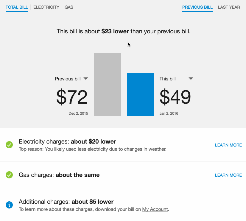
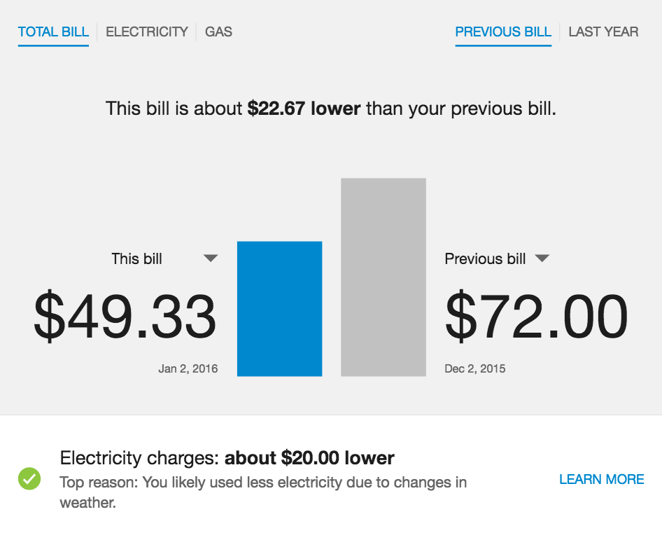
Bill Comparison
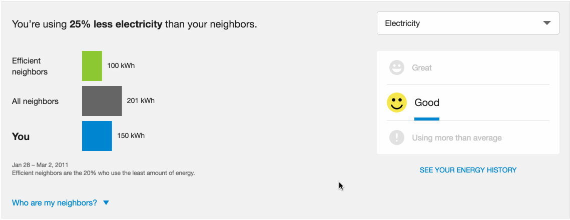
Neighbor Comparison (notice the winking smiley face!)
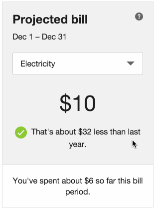
Projected Bill
Goal #2: Design for international clients
Historically, many of Opower's products were difficult to internationalize because they were designed mainly for English-speaking audiences. Languages with long words (ie. German) were the most challenging to accomodate because they did not fit well into layouts designed for short languages like English. With Opower's business moving into more interational markets than ever, this was an especially important problem to solve.
To overcome this challenge, I reviewed designs early and often with the internationalization team to identify potential issues. These issues occurred most frequently in places where containers that were designed to fit short English words (ie: chart labels) would be too small for longer translations. On the other hand, larger containers with shorter strings of text produced large visual gaps that distanced messages from what they referred to.
To create the best design for all languages, I built a system where each widget contains styles for two different layouts that can be chosen with a simple flag in a configuration file. The image below demonstrates how the "long language" layout differs from the default design.
From left to right: Text is smaller in these areas of Projected Bill; Dropdowns replace tabs, dollar amounts are smaller in Bill Comparison; Chart labels are given their own line in Neighbor Comparison's mobile format.
Enabling the long language layout is as easy as setting a flag in an existing configuration properties file. Implementation engineers would no longer need to patch the code for longer languages, but if they needed to, I made it easy to extend and change these styles by isolating them into their own stylesheet.
Goal #3: Build reusable components for common patterns.
Opower's products are built with a framework that supports componentized design. This allows our team to isolate commonly used elements into their own components which are included as dependencies in our products. When we update a component, the change cascades everywhere it's used. This centralization is important for any design system.
This family of widgets were the first to be built together, so I had an opportunity to think about the design holistically. In addition to using Opattern styles, I created reusable systems and components that would be available to all other widgets.
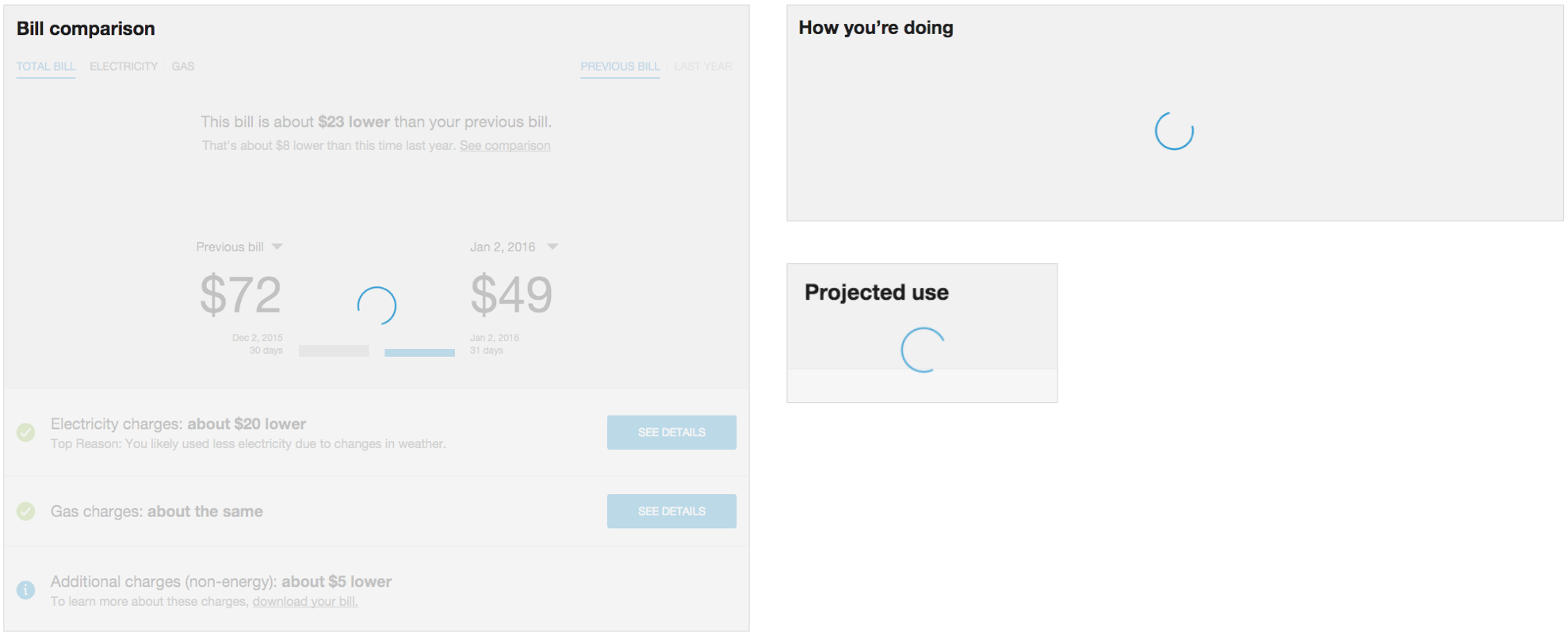
Spinner. This spinner component can be added to any widget to spin as it loads. Its color is derived from the widget's primary color.
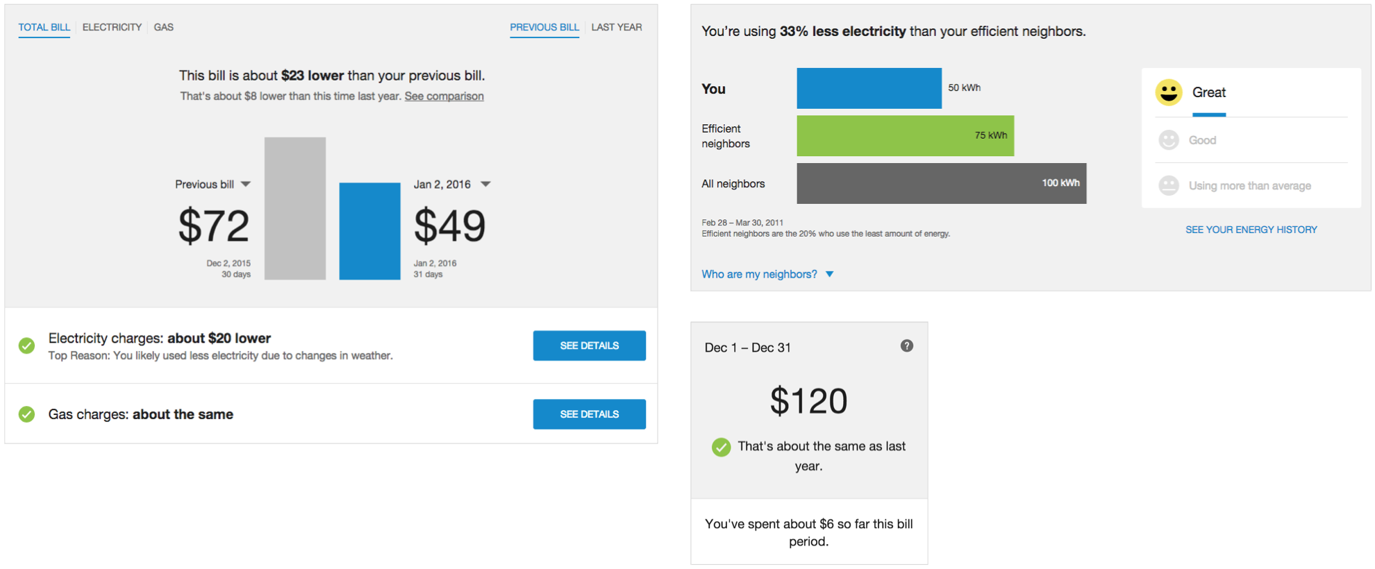
Removable Headers. All new widgets use the same removable header system that gives utilities the option to use their own headings instead of ours. This became a requirement when we began embedding widgets directly into utility websites where code heirarchy is already established. Headers are hidden in the example above.
Rounding. This rounding filter lets the utility decide how to format rounded and negative numbers (a distinction that varies by locale). In this example, the costs are not rounded.
Goal #4: Create a system for customization.
Opower's products are sent on behalf of utility companies around the globe. This means that our products must match each utility's unique brand.
The typography, colors, and sizing of each energy widget needed to be flexible, and the way that an implementation engineer would change these properties needed to be consistent. I needed to define a customization system that every widget would follow.
To do this, I worked with other designers to define a standard set of configurable qualities for every widget (colors, fonts, spacing). Because our design system was built with Sass, this was as easy as picking variables from our styleguide.
Then, I worked with implementation engineers to develop a "configuration guide" for each widget that outlines what can be configured in each widget, how to do it, and what effect it will have on the design. The guide is split into four categories:
- Style configurations. Colors, fonts, etc.
- Functional configurations. Rounded numbers, removable headers, etc.
- Breakpoints. Layouts at different sizes.
- Recommended configuration sets. Standard sets that engineers can use for different types of clients—standard, international, embedded.
To wrap it all up, I created a template of the configuration guide for other developers to use with their own widgets.
The result of this process standardized the qualities that could be configured in our web products. This was simpler to explain to clients, easier for engineers to implement, and led to better consistency with the utility's brand.
My role @ Opower
Many different teams were involved in product development process at Opower. The bubbles below represent the team members that I worked most closely with.
A typical design process begins when a Product Manager hands off a product requirements document to the design team. UX Designers use these requirements to develop concepts and wireframes as they move through the earlier phases of the design process. UX researchers conduct exploratory research to inform the initial direction of the design, and later contribute qualitative usability studies.
UX Designer/Developers like me help to refine the details of the design and tie it into our design system. We also contribute code specs and often build products for production. We partner closely with Engineering to code review eachother's work and make sure the final result works smoothly and follows the design system.